A Simplistic View of the Stock Market
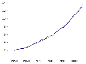
As can be seen in Figure 1 the GDP in the US has been on a very stable growth path for the last 50 or so years. There is certainly deviation from steady growth but the variations are overwhelmed by the growth path. Macroeconomics provides some convincing models for the long-term trend and the short-term variations, so this 2% growth in real GDP (3.3% nominal growth here) does seem to be a reasonably supportable trend.
We would expect the value of the stock market to follow a similar stable path if what it reflects is the long-term discounted value of the firms generating the GDP. This would be especially true if investors were planning on holding stock for a long-time and thus were mostly insensitive to the short-term variations.
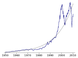
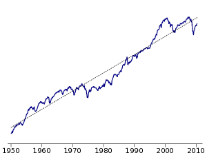
Figure 2 shows the performance of the US stock market over the same 50 year period. It seems to deviate much more sharply from the simple regression line. However, when viewed in a log scale the regression still seems to make sense, and those deviations match quite nicely to times of market under or over-valuation, such as the 2001 and 2008 booms and the bear market of the 70s and 80s. So if we believe that the fundamentals of the economy imply stable yearly growth the regression line in the graph should be a decent measure of the true value of the stock market.
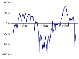
Figure 3 shows the percentage difference between the value of the S&P500 and of its regression (as shown in Figure 2). The first thing that jumped at me is that according to this the financial crisis was the best time to enter the stock market in 20 years, and that the market is still undervalued. Another interesting result is that the dot-com boom was the largest by far, dwarfing both the 2008 boom and the valuations of the 60s.
As advertised, this is a very simplistic analysis. Don’t go buy stock based on this. Off the top of my head here are some reasons why this is flawed:
- 2% real growth in the US economy may not be sustainable going forward
- Use of debt by companies has probably changed over these years, shifting the total value between stocks and bonds
- The percentage of the economy represented in the stock market may have changed, with more or less private ownership
After all the caveats this still gave me a much more immediate feel for the risk involved in these markets. The wild swings reported by hour-on-hour CNBC-style coverage are the microscopic features of the underlying growth (7% in the regression line).
- See the reddit comments for a very interesting discussion on this.
- S&P data is from Robert Shiller and includes a much broader time series than the 50 years used here, as well as information on P/E ratios and CPI index
- Grab the spreadsheet to play on your own (Gnumeric, Excel)